Dashboard (CO₂ Tracker & Leaderboards)
The dashboard is the visibility layer of EzFlow. It makes participation, commuting patterns and measured outputs more understandable for users, schools, workplaces and partners without overstating certainty or maturity.
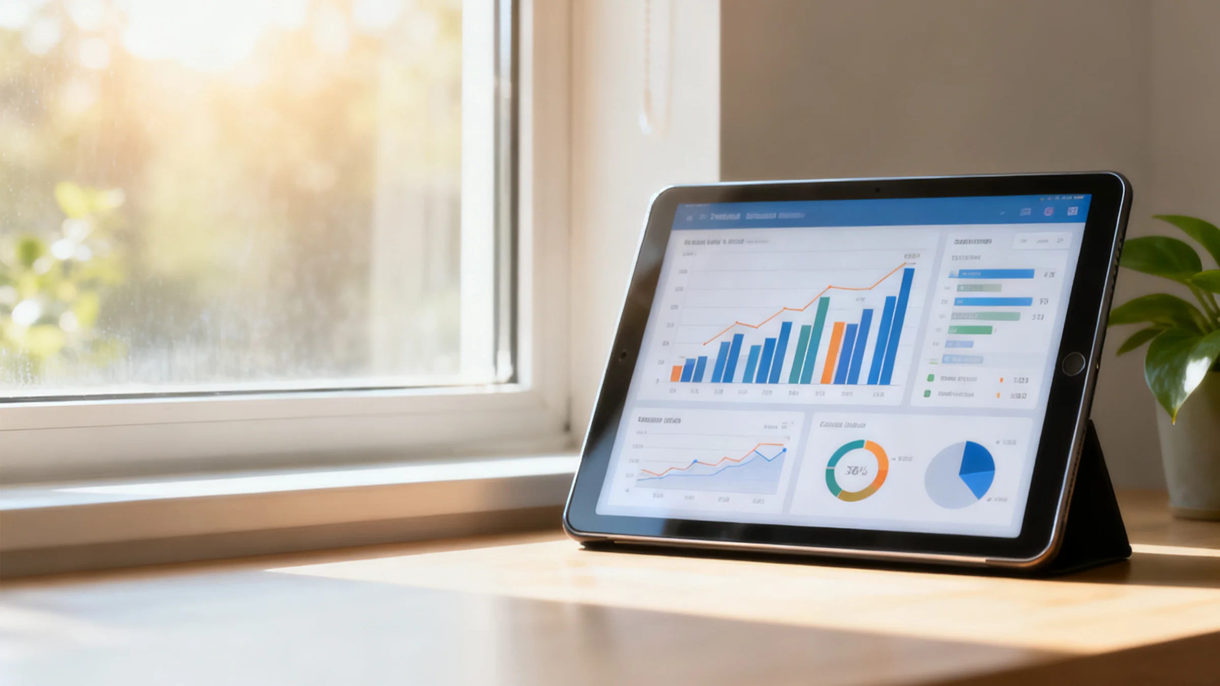
Personal Participation Tracker
Users can see how their commuting activity, participation and progress accumulate over time through a structured and easy-to-understand interface.
Context and prompts
- The aim is not perfection. It is to make participation and progress visible over time.
- Small routine shifts can matter when they are repeated consistently across households or teams.
- The most useful dashboard is one that helps users understand behaviour, not just scorekeeping.
Breakdown by Activity
Next Milestone
Milestones are intended to reinforce behaviour and visibility, not inflate claims.
Projected participation path
Where relevant, the system can estimate how current participation patterns may develop over a longer period.
Leaderboards and cohort views
Leaderboards are used to support visibility, momentum and coordinated participation across individuals, schools, workplaces and broader programmes.
Organisational Dashboard
Beyond user-facing visibility, EzFlow is designed to support school-safe and enterprise-grade reporting views for programme owners, operators and partners.
For schools and programme leaders
School-linked views are intended to show aggregate participation, engagement signals and school-level programme progress without exposing sensitive student-level information unnecessarily.
For business and partner organisations
Workplace, sponsor and partner dashboards are designed to surface commuting patterns, participation signals and structured outputs relevant to programme review, mobility planning and stakeholder reporting.
Detailed dashboard access should remain role-based and governed. Public-facing communications should use aggregate data carefully and avoid making claims that exceed the underlying evidence.
Motivational Design
The dashboard is intended to encourage useful behaviour through visibility, progress and shared mission rather than guilt or overstated gamification.
Goal Progress
Progress views help users understand where they are in relation to a wider school, workplace or programme mission.
Positive Social Proof
85%
Shared visibility can strengthen participation when it is used carefully and proportionately.
Celebrate Achievements
Recognition should reinforce useful behaviour without distorting the seriousness of the system underneath.
- •Progress views that make participation easy to understand.
- •Positive social proof that highlights coordinated effort without shaming non-participants.
- •Milestones and badges that reinforce steady engagement.
- •Cohort views that help schools and workplaces build shared momentum.
- •Adaptive programme settings that can evolve as proof quality improves.
Explore how visibility and reporting fit into the wider platform.
Leaderboards, dashboards and reporting are not separate products. They are views into the same governed commuting system.
View Leaderboards